

The 4-Page Website Framework Every Consultant Actually Needs
Your first 10 clients don’t need a digital mansion. They just need clarity. Stop overbuilding and start landing clients.

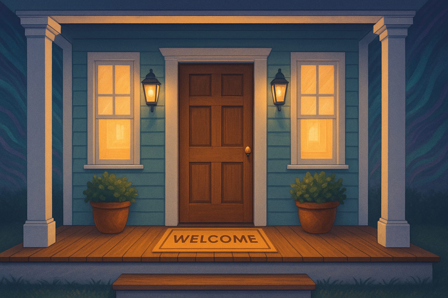
Forget the Mansion. Build a Porch.
Last week, someone asked me: “How many pages does my consulting website need?”
Her list was…long. Blog. Case studies. White papers. Portfolio. Lead magnets. Podcast. A few other services pages. And. And. And.
But here’s the truth: if you’re launching a consulting practice, you don’t need a digital mansion. You need a solid front porch—simple, welcoming, and built to start real conversations.
Why Clarity Beats Complexity
When you’re starting out, credibility isn’t built by how big your site is — it’s built by how clear it is.
The consultants who win their first clients fast don’t spend months perfecting a 20-page site. They launch with a lean, focused framework that answers three simple questions in the first 30 seconds:
Who are you?
What do you do?
How can I work with you?
The 4-Page Framework
Here’s the 4-page website framework every consultant actually needs:
Homepage — Positioning, credibility, and the fastest route to “Yes, this is for me.”
About Page — Who you are, why you get it, and why they can trust you.
Services Page — Clear, simple offers. Not 10 packages. Just enough for the first 10–20 clients.
Contact Page — Make it ridiculously easy to start the conversation. (No, a 27-field form is not a conversation starter.)

10-Minute Audit:
Pull up your site and ask:
Can a new visitor answer who you are, what you do, and how to take the next step in under 30 seconds? (If not, your homepage might be trying to do too much—or saying too little.)
Are your four core pages clear, easy to navigate, and consistent in tone, design, and message? (A cohesive feel builds instant trust; inconsistency triggers hesitation.)
Is there one clear call to action per page? (Book a call. Read the guide. Join the list. One, maybe two choices = action. Five choices = paralysis.)
Are your calls to action placed where readers actually decide—not just where you had space? (CTA buttons at natural decision points always outperform ones crammed into the footer.)
Do your pages pass the “scroll test”? (If someone skims, do your headlines and CTAs still tell the story?)
Do you have any extras—blog, portfolio, case studies—that are helpful but not distracting? (If they’re not adding context or credibility, they’re clutter.)
If not, simplify. The goal isn’t more. It’s clearer.
Why Less Wins More
A polished 20-page site won’t save you if your message is muddled.
Clarity converts. Complexity just eats your weekends.
From Pages to Offers
Next week, we’ll talk about messaging — specifically, how to write offers that land with your first 10 clients (without sounding like you’re still in corporate).
Untangling the chaos, one thread at a time.
—Lisa
Digital Detective at B Unlimited ✦ Curator of Unhidden ✦
Ooh this is good